I read this article, The decline of the user interface and had some thoughts.
Middle Click Hijacking & Uselessness
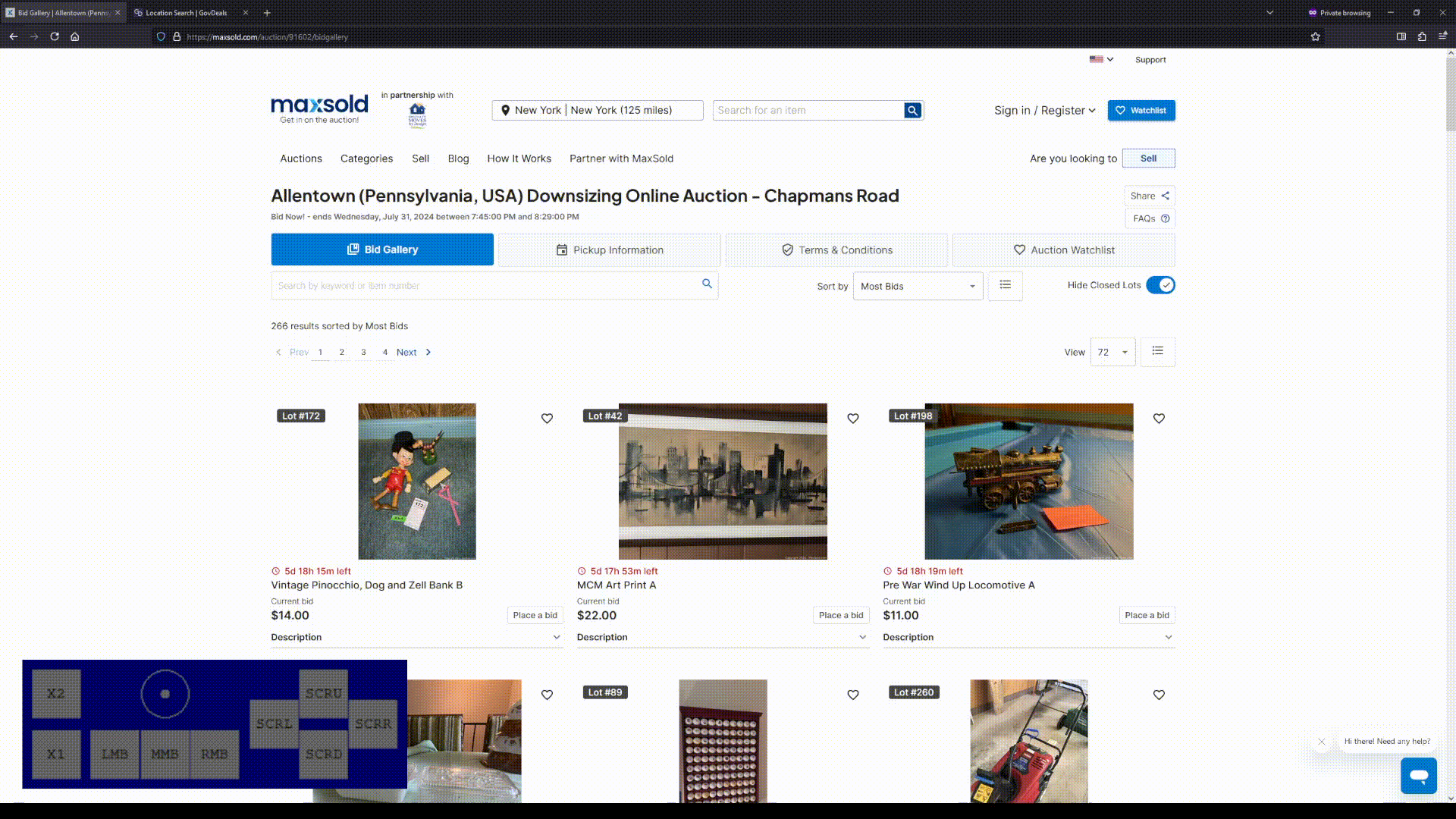
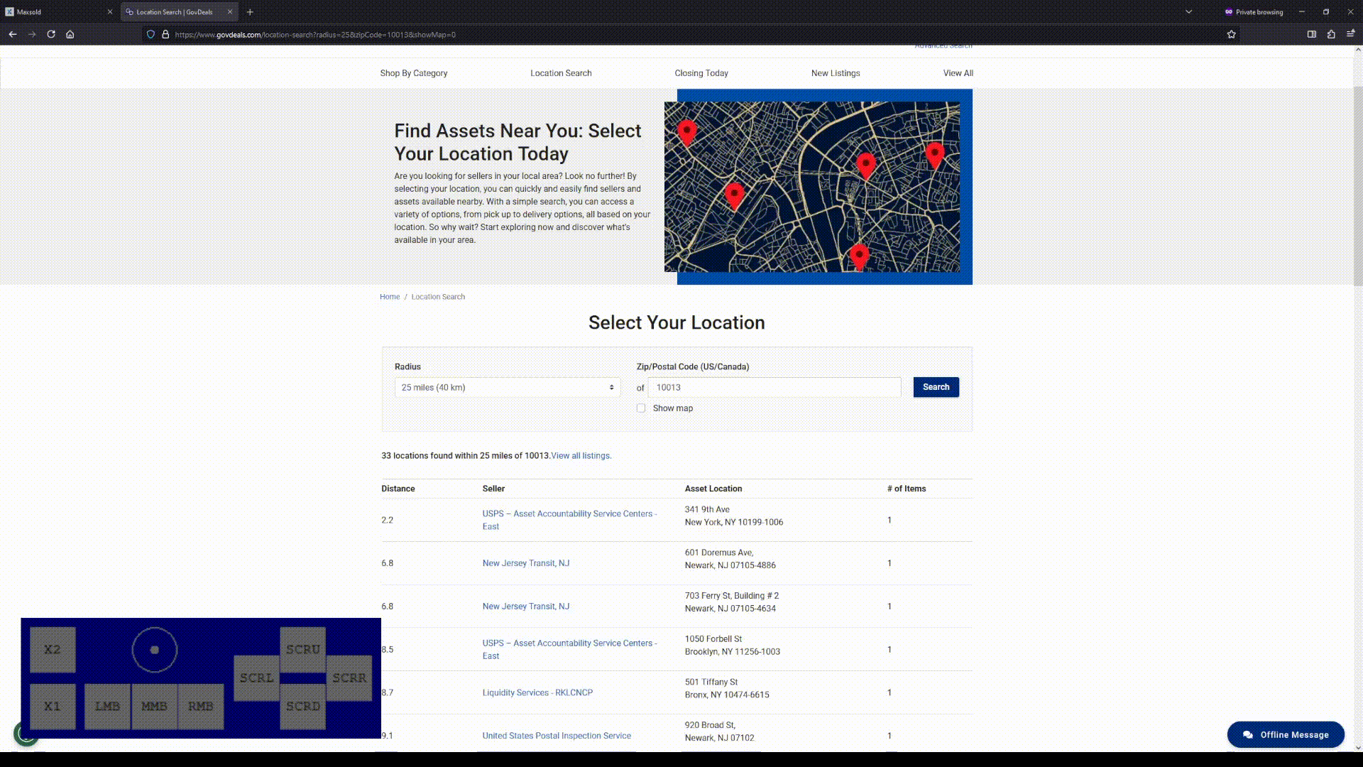
Middle click is often now a big nothing. Whereas on the old internet, I could very reliably middle-click to open things in a new tab... this is no more. It often does nothing. Jira Cloud boards won't let me open a ticket with middle-click anymore. Govdeals in the list of auctions is an offender. Maxsold is the same when trying to view pickup information within an auction.
Two examples of a broken middle click, using Nohboard to illustrate what I'm clicking on (MMB is the Middle Mouse Button).
Right Click Hijacking
Right click is often the same. It used to reliably open the browser's right click context menu. It doesn't do that anymore on Jira Cloud, and in many areas of the Slack browser web instance. I totally understand how some web apps are complex enough to warrant a right click takeover -- doesn't make it any less annoying, though.
Content Loading In Late
In modern site architecture, content often loads in after the base layout parts of the site have loaded in. This is, I'm told, excellent for Google PageSpeed and Lighthouse scores. It's a particularly terrible user experience: if you've scrolled down in a list, you lose your place in that list, because it kicks you back to the top. Govdeals is an offender. Maxsold, if you open an auction in the same window, doesn't remember where you are in pagination and brings you back to the top, while also resetting your posts per page (presumably, this is a broken implementation of some sort, but it still sucks).
Keyboard Controls
Keyboard controls are generally spotty compared to how they used to be. There was a time when I could browse most of the internet without a mouse. I did it for fun sometimes (nerd, sorry). It sucked to fly through all the menus of a site, given accessibility skip links weren't really a thing yet. But I could actually get through site and page content with my keyboard, and often perform most operations I'd needed a mouse for with my keyboard. Not so much anymore. I don't really have specific examples here and I'm guessing this is just kind of a byproduct of how much complicated stuff you can do these days.
An example of trying to keyboard through the Govdeals website, wherein there's no way for me to access the central list of auctions (arguably, the entire point of the site) with my keyboard. Pressing tab to navigate through the site skips me from the header down to the footer without ever entering the list of auctions:
User Styles
User styles are now very often impossible to write. User styles are a way for users of a site to add their own custom CSS to a given site. This allows for custom color schemes, hiding various useless elements, and similar tweaks and adjustments. UserStyles.world has good examples and a walkthrough about how to use them.
However... the rise of "autogenerated" CSS classes from JavaScript libraries such as React and Vue have made this impossible. If the CSS class is "af93cx393" and it's different on every element, I can't style the site how I want, and I'm limited to the options provided by the site itself.
Jira Cloud is an offender here, along with a truly dystopian, horrible HR software I will not even name, to keep you from searching and driving traffic to their site and (god forbid) buying their product.
As a result... I can override nothing and sites that could be more usable to me are filled with useless garbage and a zillion buttons.
Summary
Everything is filled with too many buttons and useless junk. Everyday users don't want to have to read documentation to figure out which buttons are important to click and what they actually need to look at. It does indeed often feels like someone took the concept and discipline of information hierarchy, rolled it around in dirt, doused it in kerosene, and set it on fire.
I don't really know or understand what happened to User Experience as a discipline. It seems to have fallen utterly by the wayside -- or perhaps became obsessive about metrics and click engagement rates over the user themselves? Understandable, since it seems to mirror what's gone down in development.
How I Experience The Web Today -- yup.